08 March 2016
Style guides are very challenging to build, though the initial idea of creating one always sounds like a total dream.
You have to create a bunch of components that are completely flexible, preferably CSS only, are well documented, and perform well across browsers. But they greatly contribute to brand consistency and rapid prototyping so we understandably :swoon: endlessly.
I spent a lot of time last year refining a style guide I inherited and rebuilding many components. It quickly becomes apparent that testing the flexibility of these components and experimenting to anticipate odd situations was an essential part of its sustainability.
Many design and development limitations here can be anticipated and resolved through easy adoption of a “playground”, that is, an outside place to test and tinker with core style guide components.
Let’s take a quick look at the needs, a specific problem I ran into, and the proactive approach I then implemented going forward as a result.
^^ That’s really what it’s all about.
Bits of UI that are included within a style guide need to potentially accommodate several products. Sometimes mobile use will be essential, sometimes the layout will be different, sometimes the content and data will be super lengthy, sometimes a combination of these UI pieces is needed.
Whatever the situation the style guide needs to be ready for it. Creating custom UI per project is a huge time sink and challenges the brand consistency we all work so hard to maintain.
Displaying all the appropriate code (both markup and styling) to grab and go is also incredibly handy.
The user shouldn’t have to worry too much about testing, digging for code, or writing a bunch of CSS; if a style guide requires too many overrides then it’s not a successful project.
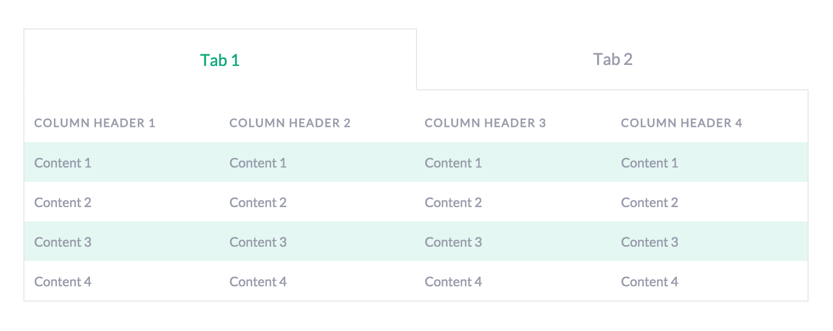
In keeping these needs/goals in mind I quickly ran into my first roadblock. I needed to put a table inside of tabbed navigation, but each of these on their own were too fragile to make this work.
We wouldn’t want someone to have to get these tabs just so in the event that they need more or fewer tabs than what is demoed in the guide. My priority here was to build tabs with flexbox that were smart enough to readjust when the markup was removed.
See the Pen Flexible Tabs by Joni Trythall (@jonitrythall) on CodePen.
If fewer than the displayed five tabs are needed all the user has to do is remove the appropriate input, label, and content div elements. The tabs will then readjust accordingly without having to fuss around with the CSS at all.
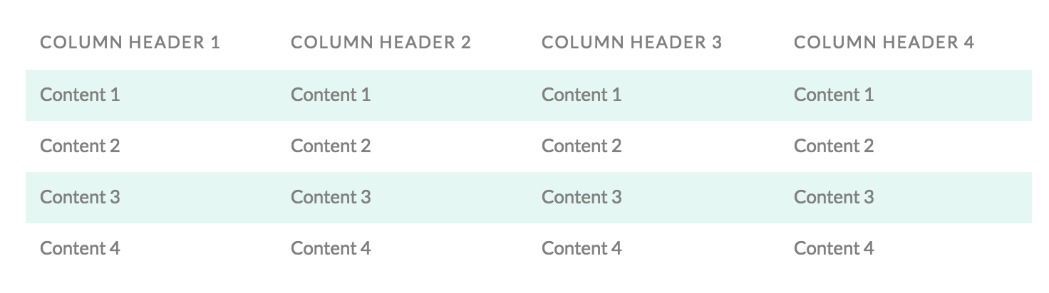
The second issue I ran into was in regards to the basic table.
I needed to build a table that was responsive but also didn’t force anyone to scroll to reveal data on mobile. Given these constraints and the inherent challenging nature of HTML tables the only option seemed to be restructuring the data on smaller screens.
The approach I decided to take here was largely inspired by this table by Geoff Yuen.
See the Pen Basic Table by Joni Trythall (@jonitrythall) on CodePen.
Jump into CodePen to demo the full experience by adjusting the browser window.
The content still says the same thing but it’s displayed in a much friendly way when the screen size warrants it.
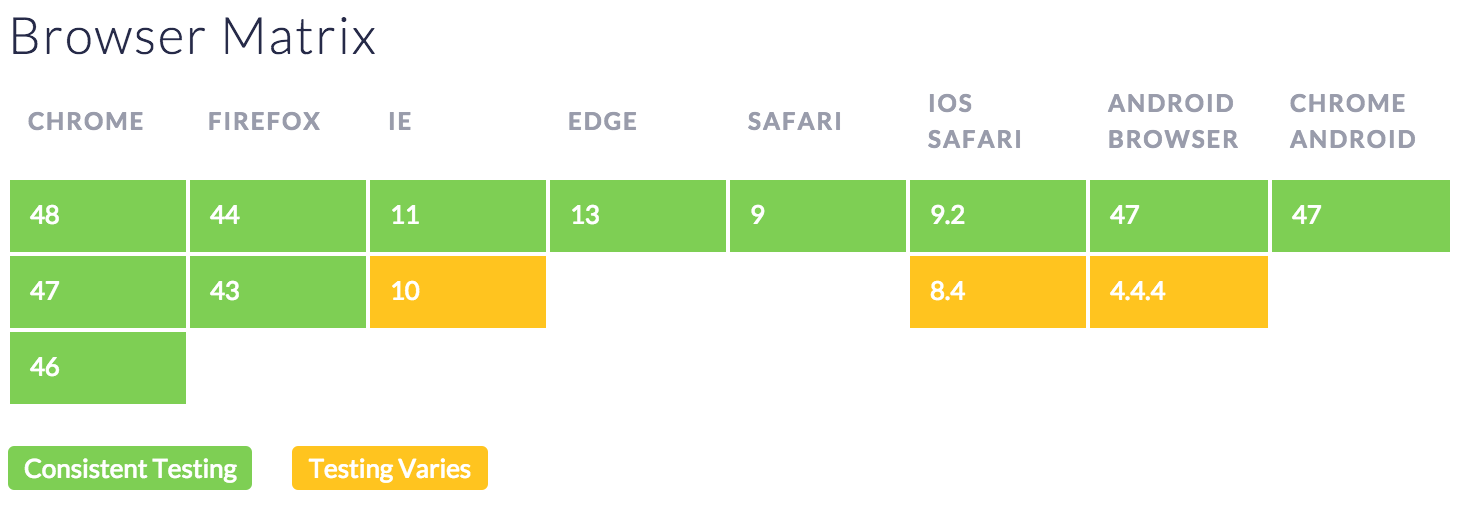
I was even able to put a browser matrix together with it, utilizing display: none on mobile for cells without content:
Through experimenting and testing it became clear that with this new solid foundation in place the components were much more flexible and handled being injected into other components with much more class and sophistication.
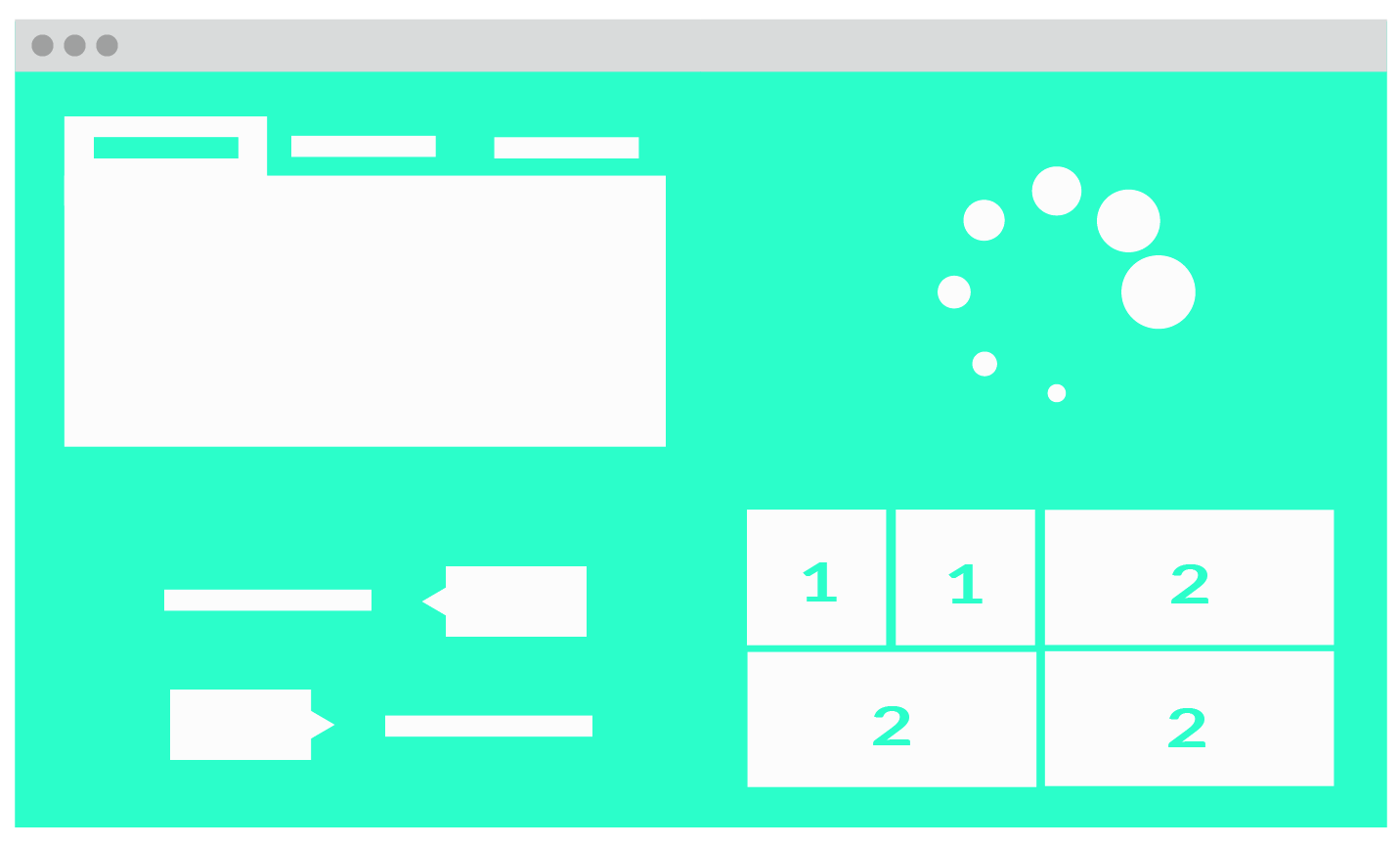
In the example below the new table can be included within the new flexible tabs. The entire scenario, and others like it, can then live within a playground and be tested according to whatever browser matrix you are working with.
See the Pen Responsive Table in Flexible Tabs by Joni Trythall (@jonitrythall) on CodePen.
This is not meant to be anything fancy, and perhaps you’ll have a different name for it. It’s simply a place to use the components from the style guide outside of the style guide and tinker with them like crazy.
It can be as straightforward as a long form test case for cross browser testing purposes and forcing those not ideal (but likely) situations.
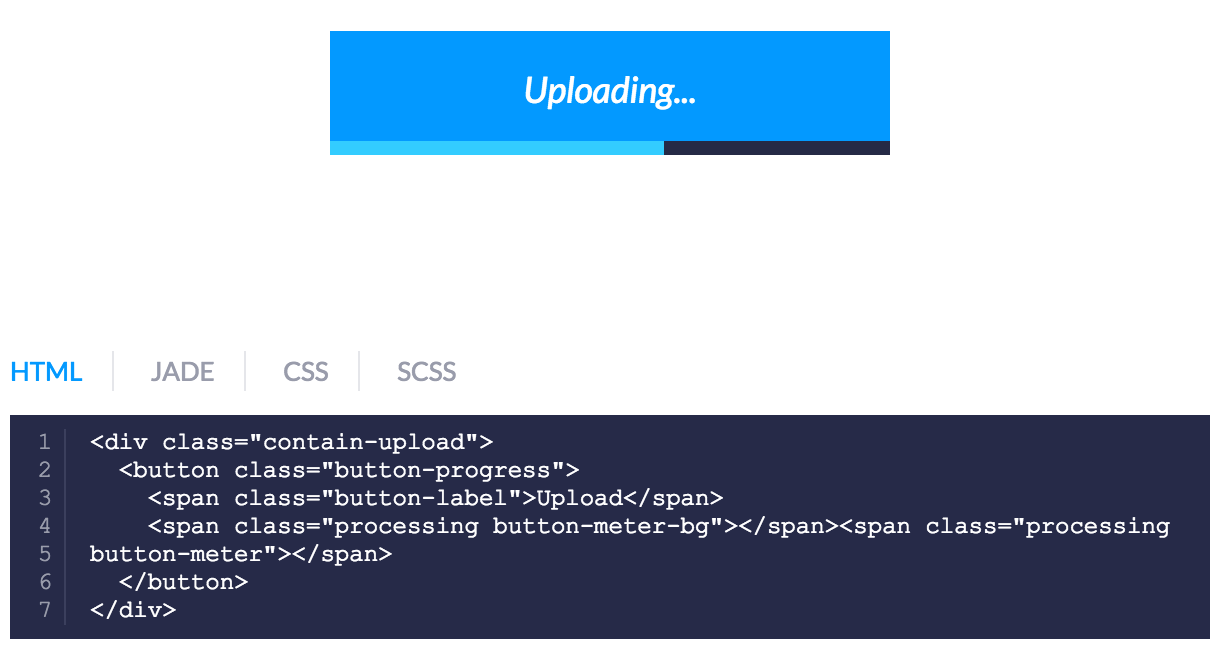
What happens when you put the established spinner/loader inside of a button? How will tooltips perform on smaller screens or even within a table? … Let’s try all these out for science and within context.
Don’t forget to document any interesting findings or helpful how-tos within the style guide itself. It’s an invaluable teaching tool and it can be helpful to think in terms of the user experience just as you would with any other project.
The users of a style guide can be developers, engineers, or marketing professionals; all with varying levels of tech skills. Making it as easy to use as possible and eliminating any surprises will be appreciated by all.
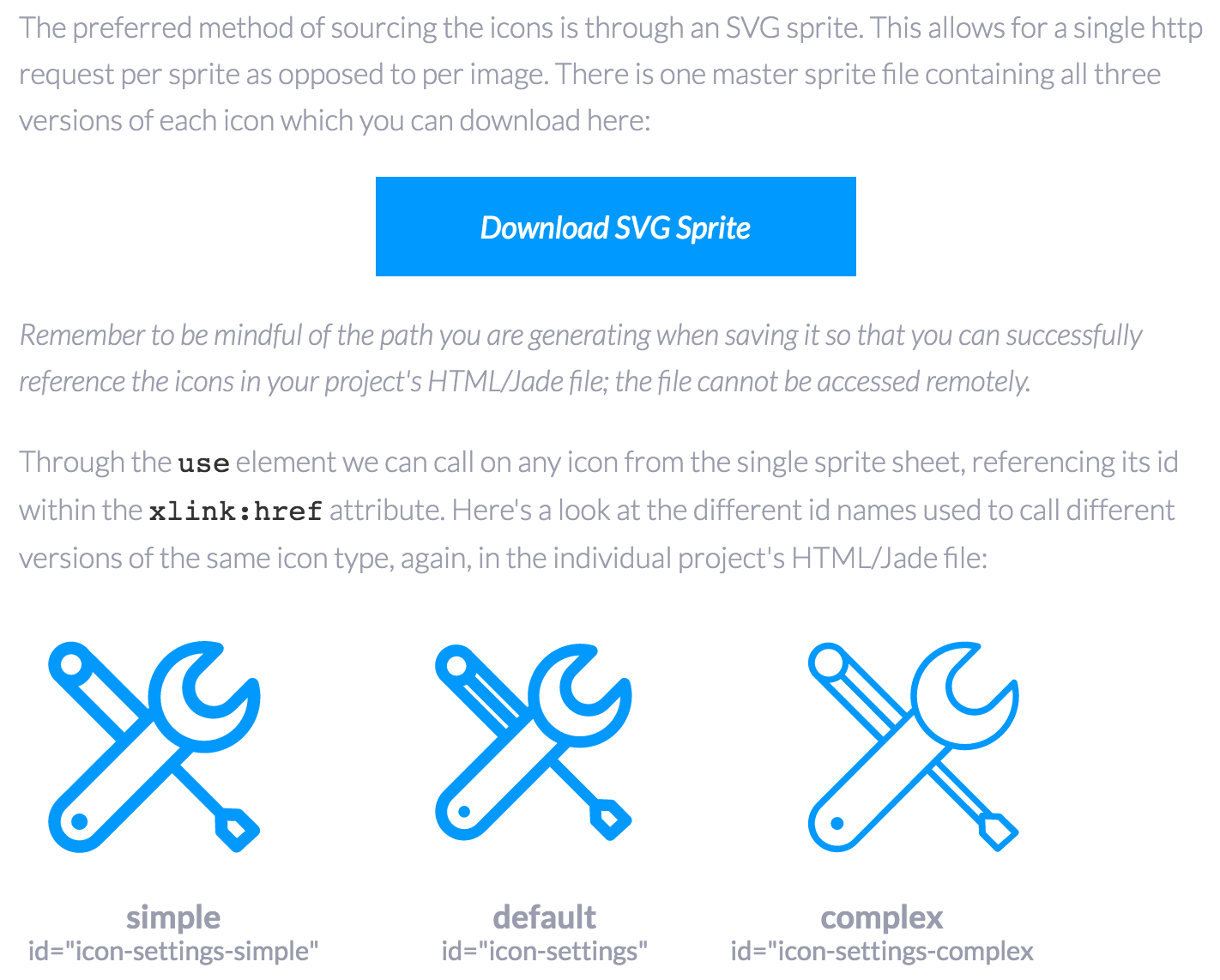
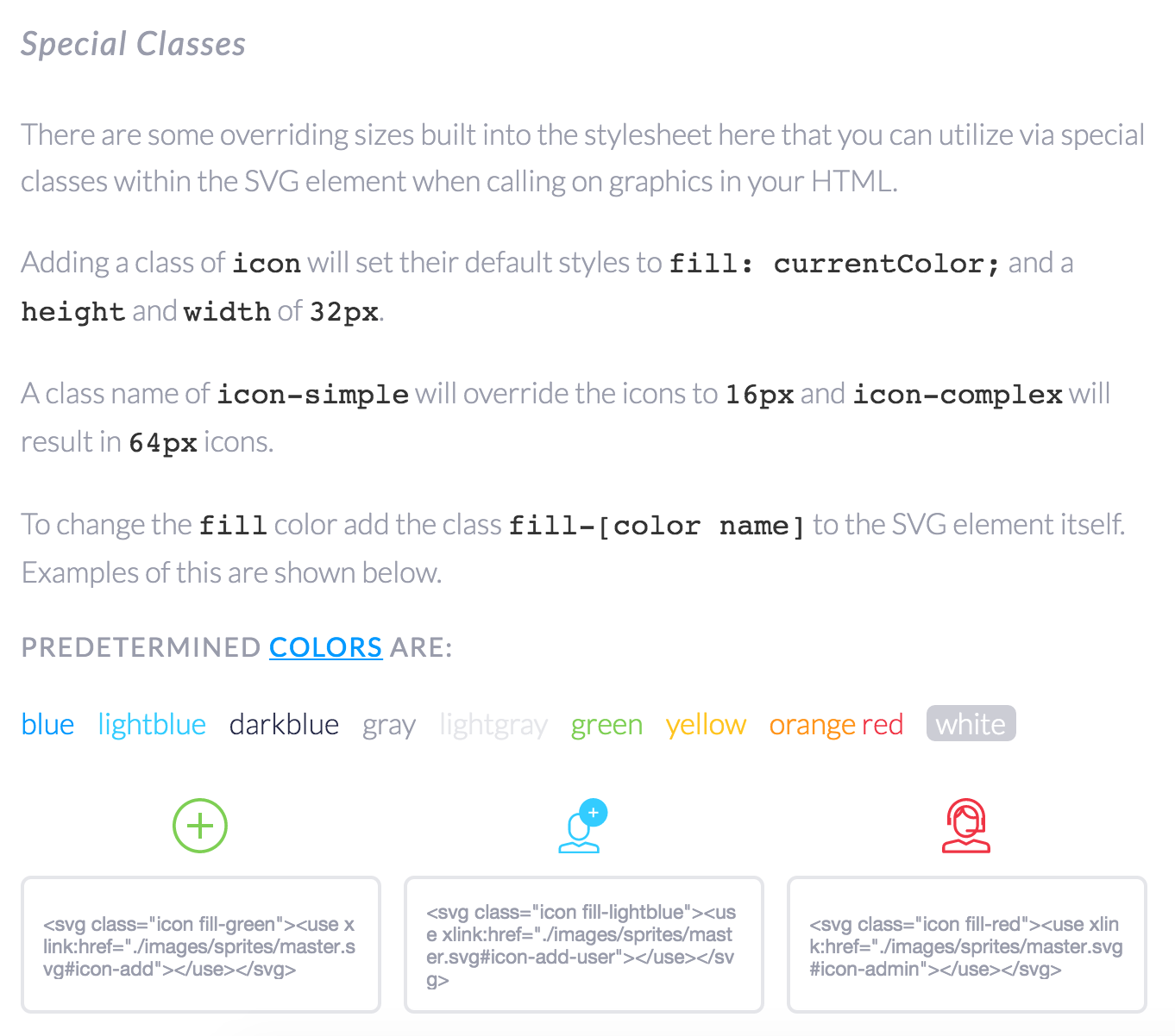
I was also tasked with rebuilding an icon system with hundreds of SVG icons. I was sure to break these down into manageable bits by creating a grouping system by fidelity level.
I also included special preset classes with instructions and diagrams; don’t forget to include language on how to add to this collection in the project’s README as well!
In order for a style guide to be an efficient and realistic project for yourself or your team to take on putting the initial thoughtful work into the foundational components is crucial. A big part of making sure these pieces are flexible and convenient is through a testing playground; get weird with it and you’ll save yourself bunches of time and headache later.
As a final note, don’t forget that a style guide is a guide. Taking it too literally can often result in stifling the chance for all innovation going forward. If something isn’t working in terms of design or development there has to be resources in place to keep it relevant. It is, afterall, a product in itself.