05 March 2014
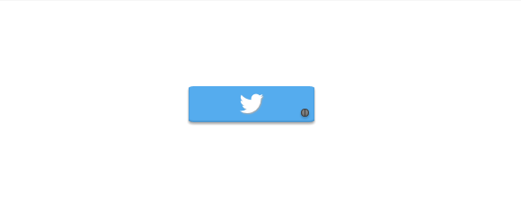
For the most part, social media buttons and color change on hover go hand in hand. This gets the job done, but the possibilities with these things are literally endless. For this demo we will get pretty scandalous and push CSS beyond a basic color change for a Twitter button. Let’s take a look at the animation involved with a hinged button effect.
 View this guy in action here on Codepen.
The first step we will take in creating our Twitter button is styling a series of <span> tags that are wrapped in one main <a> tag. One <span> will be the button’s face, another will be the handle behind the face, and finally one for the screw. In order to keep this from being painfully long and boring, I will leave you to look at the HTML and SCSS tabs above for the dirty details on styling and positioning the button.
Once the styling is in order, we need to set up our animation. We want our button’s face to appear as if it is swinging open and stay open for as long as the user is hovering over it. The first step in setting up our @keyframes for this is establishing the point of origin for the face of the button. By default its point of origin (where it will turn from) is its middle. We positioned our screw near the bottom right corner, so we will need to create custom transform-origin values to line up with where the screw is. Based on where I positioned the screw the point of origin for the animation ends up being transform-origin: 128px 30px;
Within our @keyframes commands we will set up four moments in time: 0%, 25%, 50%, and 100%. Within each of these moments we will include transform-origin: 128px 30px; for consistent movement from this point. The remaining animation will be establishing transform: rotate() values. You will want to vary these in a way that mimics a natural “swinging open” look. Here’s a peek at the rotation degrees I used:
@keyframes open {
  0% {
    transform-origin: 128px 30px;
  }
  25% {
    transform-origin: 128px 30px;
    transform: rotate(-120deg);
  }
  50% {
    transform-origin: 128px 30px;
    transform: rotate(-70deg);
  }
  100% {
    transform-origin: 128px 30px;
    transform: rotate(-90deg);
  }
}
Now that our @keyframes is established, we need to trigger the button’s face to open on hover. To do this we will add the animation to a:hover .button-face
a:hover .button-face {
  animation: open 1s forwards;
}
We have told our button to take on the commands of @keyframes open, to complete the animation within 1 second, and the addition of forwards will ensure the button face stays open for as long as the button is being hovered over. It will be uncooperative and try to close right away otherwise. What a jerk.
The closing animation was especially tricky and Will Boyd gets total credit for figuring it out. The difficult part was getting the closing animation that is assigned to the button face to not be triggered on page load. We want it to only close once the user has removed the mouse from it. By adding an additional animation of “stay” that maintains the button’s original state to the existing “close” animation we achieve a pure CSS “mouseout” effect that does not activate when the page first loads. This stuff is amazing. Here is a look at the CSS:
@keyframes close {
  0% {
    transform-origin: 128px 30px;
    transform: rotate(-90deg);
  }
  100% {
    transform-origin: 128px 30px;
    transform: rotate(0deg);
  }
}

@keyframes stay {
  0% {
    transform-origin: 128px 30px;
    transform: rotate(0deg);
  }
  100% {
    transform-origin: 128px 30px;
    transform: rotate(0deg);
  }
}
Happy “button” animating!